
Selecting a color palette for your home can be a daunting task, but understanding color theory can make all the difference. Color theory is a set of principles used to create harmonious color combinations that can enhance the aesthetic appeal of your home.
Different colors can evoke different emotions and moods, making it essential to choose colors that reflect your personality and style. By applying the principles of color theory and considering the psychology of colors, you can create a beautiful and inviting space that feels like home.
With a little guidance, you can learn how to select the perfect colors for your home, creating a harmonious and welcoming atmosphere. This article will walk you through the process, providing practical tips and insights on interior design color schemes.
Table of Contents
Understanding Color Theory Basics

Understanding color theory is essential for creating a harmonious home decor. Color theory provides a framework for selecting colors that work well together, enhancing the aesthetic appeal of your living space.
The Color Wheel Explained
The color wheel is a circular representation of colors, showing how they relate to each other. It’s a fundamental tool in color theory, helping you understand how to mix and match colors effectively.
Primary, Secondary, and Tertiary Colors
Primary colors are red, blue, and yellow. These colors cannot be created by mixing other colors. Secondary colors, such as orange, green, and purple, are derived from mixing two primary colors. Tertiary colors are created by mixing primary and secondary colors, adding more nuance to your palette.
| Color Type | Colors | Description |
|---|---|---|
| Primary | Red, Blue, Yellow | Base colors that cannot be mixed |
| Secondary | Orange, Green, Purple | Colors created by mixing primary colors |
| Tertiary | Red-Orange, Yellow-Green, Blue-Purple | Colors created by mixing primary and secondary colors |
Warm vs. Cool Colors
Warm colors, such as red, orange, and yellow, tend to evoke warmth and can make a space feel cozy. Cool colors, including blue, green, and purple, have a calming effect and can make a room feel more spacious. Understanding the difference between warm and cool colors is crucial for creating the desired atmosphere in your home.
Hue vs. Saturation
Hue refers to the actual color (red, blue, etc.), while saturation refers to the intensity or brightness of the color. A highly saturated color is vibrant, while a less saturated color is more muted. Balancing hue and saturation is key to creating a visually appealing color scheme.
The Psychology of Colors in Home Design
The colors we choose for our homes do more than just please the eye; they significantly impact our mood and emotions. The psychology of colors plays a crucial role in home design, influencing how we feel and behave within our living spaces.
How Colors Affect Mood and Emotions
Colors can evoke different emotional responses. Warm colors like red and orange tend to stimulate and energize, while cool colors such as blue and green can calm and soothe. Understanding this can help in designing spaces that promote the desired mood and emotional state.
Cultural Significance of Different Colors
Colors also carry different meanings in various cultures. For instance, while white is associated with purity in many Western cultures, it’s associated with mourning in several Asian cultures. Being aware of these cultural significances can help in creating a space that respects and reflects the occupants’ backgrounds.
Creating Atmosphere Through Color
The atmosphere of a home is significantly influenced by its color palette. By choosing colors that work well together, homeowners can create a harmonious and inviting atmosphere. This involves balancing stimulating and calming colors to achieve a cohesive feel.
Balancing Stimulating and Calming Colors
Achieving a balance between stimulating and calming colors is key to a well-designed home. Too many stimulating colors can lead to a feeling of overwhelm, while too many calming colors might result in a lack of energy. Finding the right balance is crucial for creating a space that is both energizing and relaxing.
Popular Color Schemes for Interior Design
The choice of color scheme is a fundamental aspect of interior design, influencing the overall look and feel of your living spaces. A well-designed color scheme can enhance the aesthetic appeal of your home, creating a harmonious and inviting atmosphere.
Monochromatic Schemes
Monochromatic schemes involve using different shades of the same color, creating a cohesive and sophisticated look. This approach can make a room appear more spacious and is ideal for creating a sense of continuity.
Complementary Color Combinations
Complementary colors are opposite each other on the color wheel, making for a bold and vibrant contrast. When used correctly, complementary color combinations can add energy and visual interest to a room.
Analogous and Triadic Schemes
Analogous schemes use colors that are next to each other on the color wheel, producing a smooth and harmonious palette. Triadic schemes, on the other hand, involve three colors equally spaced from each other on the color wheel, creating a balanced and vibrant color scheme.
Neutral Palettes with Accent Colors
Neutral palettes with accent colors offer a versatile option, where a neutral base is enhanced with pops of color, adding visual interest without overwhelming the space. This approach allows for flexibility and can be easily updated with new accent colors.
By understanding and applying these popular color schemes, you can significantly enhance the interior design of your home, creating spaces that are both beautiful and functional.
How to Choose the Right Color Palette for Your Home
Selecting the right color palette for your home involves understanding the interplay between natural light, existing furniture, and personal style. A well-chosen color scheme can significantly enhance the ambiance of your living space.
Assessing Your Space and Natural Light
Before choosing a color palette, it’s essential to assess the natural light in your home. Natural light can dramatically affect how colors appear on walls and surfaces. Observe how light enters your rooms at different times of the day to determine the best color choices.
Considering Existing Furniture and Fixtures
Your existing furniture and fixtures play a crucial role in determining your color palette. Consider the colors and styles of your furniture, flooring, and other decorative elements to ensure your chosen colors complement them.
Reflecting Your Personal Style
Your home’s color palette should reflect your personal style and preferences. Think about the colors you like and how they make you feel. This will help you create a space that is both beautiful and meaningful to you.
Starting with a Foundational Color
Starting with a foundational color can help you build a cohesive color scheme. Choose a dominant color that ties your space together, and then add secondary colors and accents to enhance visual interest.
By considering these factors, you can create a harmonious and inviting color palette for your home. Remember, the key to a successful color scheme is balance and cohesion.
Implementing Colors Through Different Elements
Once you’ve chosen your color palette, the next step is to implement it through various elements in your home. This involves considering how different components of your space contribute to the overall color scheme.
Wall Colors as the Foundation
Wall colors set the tone for the room and provide a foundational element for your color palette. Choosing the right wall color is crucial as it influences how other colors in the room are perceived.
Furniture and Large Pieces
Furniture and large pieces significantly contribute to the color scheme of a room. Their color can greatly impact the overall look, so it’s essential to select pieces that complement your chosen palette.
Textiles and Soft Furnishings
Textiles and soft furnishings, such as upholstery, rugs, and curtains, offer additional opportunities to incorporate color into your space. These elements can add depth and warmth to a room.
Accessories and Accent Pieces
Accessories and accent pieces, like throw pillows, vases, and decorative items, can add pops of color, enhancing the visual interest and personality of the space.
To illustrate how different elements can work together, consider the following table that outlines a sample color implementation plan:
| Element | Color | Purpose |
|---|---|---|
| Walls | Soft Gray | Foundation |
| Furniture | Warm Beige | Complementary |
| Textiles | Deep Blue | Accent |
| Accessories | Bright Yellow | Pop of Color |
Creating a Cohesive Color Flow Throughout Your Home
To ensure a smooth visual transition between rooms, it’s vital to establish a cohesive color flow. This continuity enhances the sense of harmony and makes your home feel more connected.
Transitioning Colors Between Rooms
Transitioning colors between rooms can be achieved by using a common color or a harmonious palette that ties the spaces together. This can be done by selecting a dominant color that appears in each room, perhaps in different shades or tones.
Using Color to Define Spaces
In open-plan homes, using color to define different spaces can help create distinct zones. For example, a living area can be differentiated from a dining area through the use of complementary colors or varying shades of a single color.

Creating Visual Connections
Creating visual connections between rooms through color can enhance the overall flow. This can be achieved by repeating certain colors or using a consistent palette throughout the home.
The 60-30-10 Rule for Color Distribution
The 60-30-10 rule is a useful guideline for distributing colors in a room. It suggests allocating 60% of the dominant color, 30% of the secondary color, and 10% of the accent color. This creates a balanced and visually appealing palette.
By applying the 60-30-10 rule and thoughtfully transitioning colors between rooms, you can create a cohesive and harmonious color scheme throughout your home.
Color Palettes for Different Rooms
Creating a harmonious and functional living space involves selecting color palettes that are tailored to the unique needs of each room. Different rooms serve various purposes, and their color schemes should reflect this to enhance their functionality and ambiance.
Living Room Color Strategies
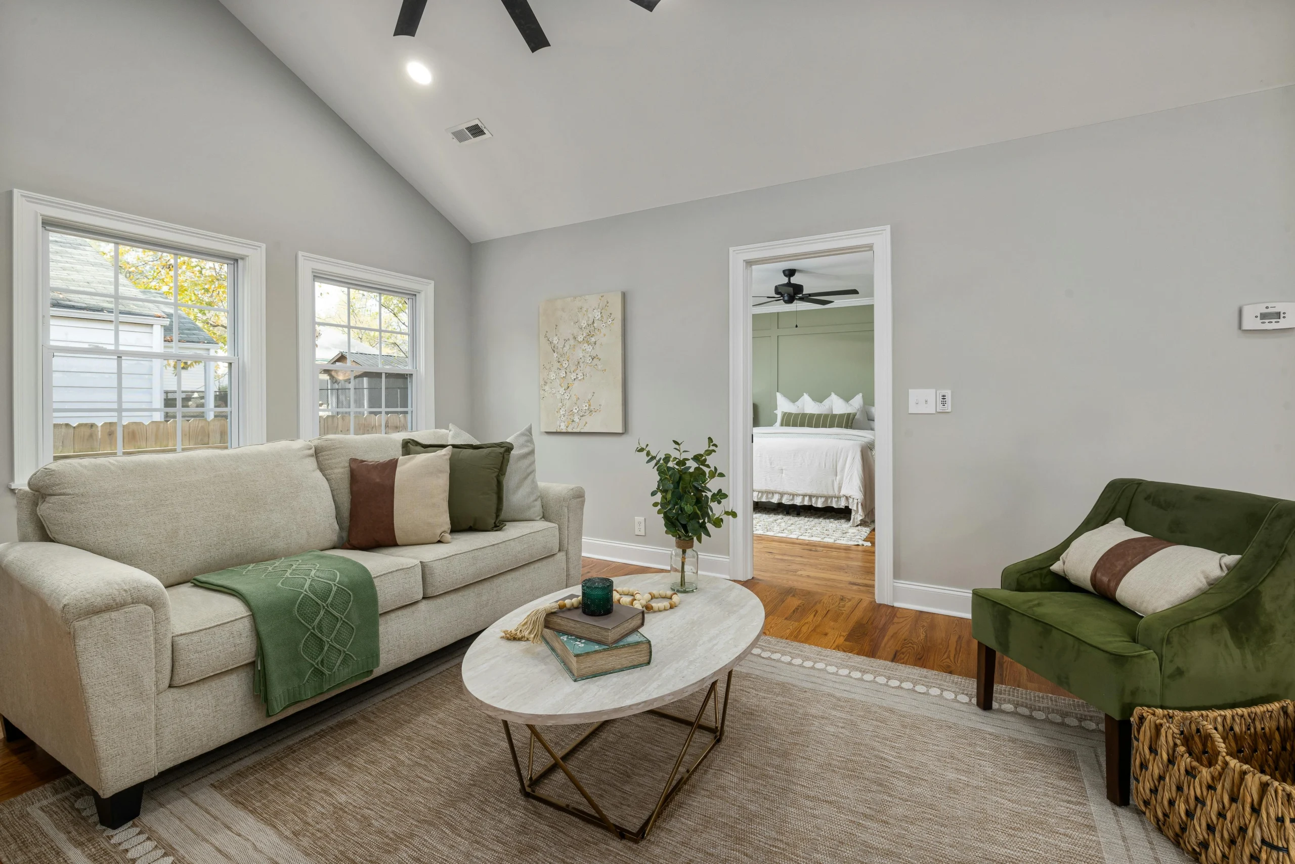
The living room is a space for social interaction and relaxation. Warm and inviting colors like beige, soft grays, and taupe can create a cozy atmosphere. For a more vibrant setting, consider incorporating accent colors through furniture and decor.
Bedroom Colors for Rest and Relaxation
Bedrooms benefit from calming and soothing colors that promote rest and relaxation. Soft blues, pale greens, and muted purples are excellent choices for creating a serene environment conducive to sleep.
Kitchen and Dining Area Colors
Kitchens and dining areas can incorporate more vibrant colors to stimulate appetite and conversation. Warm reds, oranges, and yellows can be effective, while neutral tones can provide a clean and modern look.
Bathroom Color Considerations
Bathrooms require colors that are refreshing and calming. Soft whites, blues, and greens can create a spa-like ambiance, making the space feel more relaxing and clean.
Home Office and Productivity Spaces
Home offices and productivity spaces benefit from colors that enhance focus and productivity. Consider using shades of blue and green, which are known to improve concentration and mental clarity.
By tailoring the color palette to the specific use and desired mood of each room, you can significantly enhance its functionality and ambiance, creating a more harmonious and inviting home.
Tools and Resources for Color Selection
In the digital age, finding the perfect color palette has become more accessible than ever, thanks to a range of innovative tools and resources. Whether you’re a homeowner, designer, or DIY enthusiast, these aids can help simplify the color selection process.
Color Matching Apps and Websites
Color matching apps and websites are invaluable for visualizing and testing different color palettes. Tools like Color Hunt and Adobe Color allow you to explore a vast library of colors, create custom palettes, and even extract colors from images. These digital resources are perfect for those who want to experiment with colors before making a final decision.

Paint Samples and Swatches
While digital tools are convenient, paint samples and swatches provide a tangible way to see how colors will look in your specific lighting conditions. Most paint manufacturers offer sample sizes or swatches that you can test on your walls.
Working with Color Consultants
For personalized advice, consider working with a color consultant. These professionals can offer tailored guidance based on your space, furniture, and personal preferences, ensuring that your color choices are both beautiful and functional.
Finding Inspiration in Nature and Art
Nature and art are rich sources of color inspiration. Observing the natural world or studying the works of famous artists can provide valuable insights into harmonious color combinations that can be applied to your home decor.
Common Color Mistakes to Avoid
When it comes to choosing colors for your home, avoiding common pitfalls is key to achieving a harmonious space. Selecting the perfect color palette involves more than just picking your favorite colors; it requires a thoughtful approach to create a cohesive and inviting atmosphere.
Choosing Colors That Are Too Trendy
Opting for colors that are too trendy can lead to a space that quickly becomes outdated. Instead, consider timeless hues that will stand the test of time, incorporating trendy colors through easily replaceable accessories.
Ignoring Lighting Conditions
Lighting can dramatically alter how colors appear in a room. Natural and artificial lighting can change the perceived color, so it’s crucial to test colors under different lighting conditions to ensure they look good throughout the day.
Using Too Many Colors
Using too many colors can create a chaotic and disjointed space. Limit your palette to a few core colors and use variations of those colors to maintain harmony.
Neglecting Color Undertones
The undertones of a color, whether warm or cool, can significantly affect how they interact with other colors and the overall ambiance of the room. Ensure that the undertones of your chosen colors complement each other.
Testing Colors Before Committing
Once you’ve narrowed down your color choices, it’s time to put them to the test. Testing colors before committing to a specific palette is a crucial step that can save you from potential regrets down the line.
Creating Sample Boards
One effective way to test colors is by creating sample boards. This involves gathering paint swatches or color cards and arranging them on a board to visualize how the colors work together. This hands-on approach allows you to see the interaction between different hues and make adjustments as needed.
Testing Paint in Different Lighting
It’s also important to test paint samples in various lighting conditions. Natural light, artificial light, and the time of day can all impact how a color appears. By testing paint in different lighting, you can ensure that your chosen colors look great throughout the day.
Digital Visualization Tools
For a more modern approach, consider using digital visualization tools. There are numerous apps and online platforms that allow you to upload a photo of your space and superimpose different colors onto it. This can give you a clear idea of how different colors will look in your home.
Living with Sample Colors
Finally, living with sample colors for a while can help you make a final decision. By experiencing the colors in your daily life, you can determine whether they truly work for you.
Conclusion
Choosing the right color palette for your home is a thoughtful and multi-step process. By understanding the basics of color theory and the psychology of colors, you can create a harmonious and inviting space that reflects your personal style.
A successful color palette considers the specific needs and moods of different rooms, along with practical tips for implementing and testing colors. This summary of key points will help you avoid common color mistakes and utilize various tools and resources to enhance the functionality and ambiance of your home.
In conclusion, with a solid understanding of color theory and a thoughtful approach to color selection, you’re well on your way to creating a beautiful and cohesive color scheme. By applying these guidelines, you can bring your vision to life and enjoy a home that is both aesthetically pleasing and functional.
Read Also: 10 Ideas Bold Blue Living Room Decor for a Dramatic & Cozy Vibe
FAQ
What is the best way to start choosing a color palette for my home?
Start by understanding the basics of color theory, including the color wheel, primary and secondary colors, and warm vs. cool colors. Assess the natural light in your space and consider the existing furniture and fixtures.
How do I create a cohesive color flow throughout my home?
To create a cohesive color flow, use a common color or harmonious palette that ties the spaces together. You can also use the 60-30-10 rule for color distribution, where 60% of the room is the dominant color, 30% the secondary color, and 10% the accent color.
What are some popular color schemes for interior design?
Some popular color schemes include monochromatic, complementary, analogous, and neutral palettes with accent colors. Each has its unique characteristics and can be used to create a specific atmosphere or mood.
How do I choose the right colors for different rooms in my home?
Different rooms serve different purposes, and their color palettes should reflect this. For example, living rooms benefit from colors that promote social interaction, while bedrooms require calming and soothing colors.
What are some common color mistakes to avoid?
Common mistakes include choosing colors that are too trendy, ignoring lighting conditions, using too many colors, and neglecting color undertones. Being aware of these potential pitfalls can help you create a more harmonious color scheme.
How can I test colors before committing to a specific palette?
You can test colors by creating sample boards, testing paint in different lighting conditions, using digital visualization tools, or living with sample colors for a while. This will give you a better sense of how the colors will work together.
What tools and resources are available to help me choose the right color palette?
You can use color matching apps and websites, paint samples and swatches, and work with color consultants to help you choose the right color palette. You can also find inspiration in nature and art.
How do colors affect mood and emotions?
Colors can significantly influence our mood, emotions, and behavior. Warm colors like red and orange can stimulate and energize, while cool colors like blue and green can calm and soothe.